
Top
Search
People also search for:
Stay Inspired with Instagram


With smartphones reaching a near-ubiquitous status worldwide, mobile commerce(m-commerce) now drives the majority of online retail sales. Globally, mobile e-commerce accounts for approximately 59% of total retail sales, amounting to an astonishing $2.51 trillion, and is climbing fast. Meanwhile, according to SQ Magazine, smartphones have become so indispensable that 72% of Americans admit they can’t go an entire day without them, checking their screens an average of 344 times per day.
We’ve entered an era where life without a phone is almost unthinkable, and many feel adrift without that digital lifeline in hand. Indeed, as one UK study put it, 45% of people confess they “wouldn’t be able to function” without their phone, and 83% experience emotional attachment to it.
Asking someone to go without their phone feels almost like asking them not to breathe… respectfully, of course.
Therefore, in the online shopping world, having a mobile-friendly e-commerce platform or simply m-commerce is the key. With super-dependence on mobile these days, most shoppers use their devices to shop. So, having a mobile-first approach for your e-commerce platform can boost sales and improve customer experience. This can help your brand stand out in a pool of brands. A mobile-first design meets the needs of mobile shoppers.
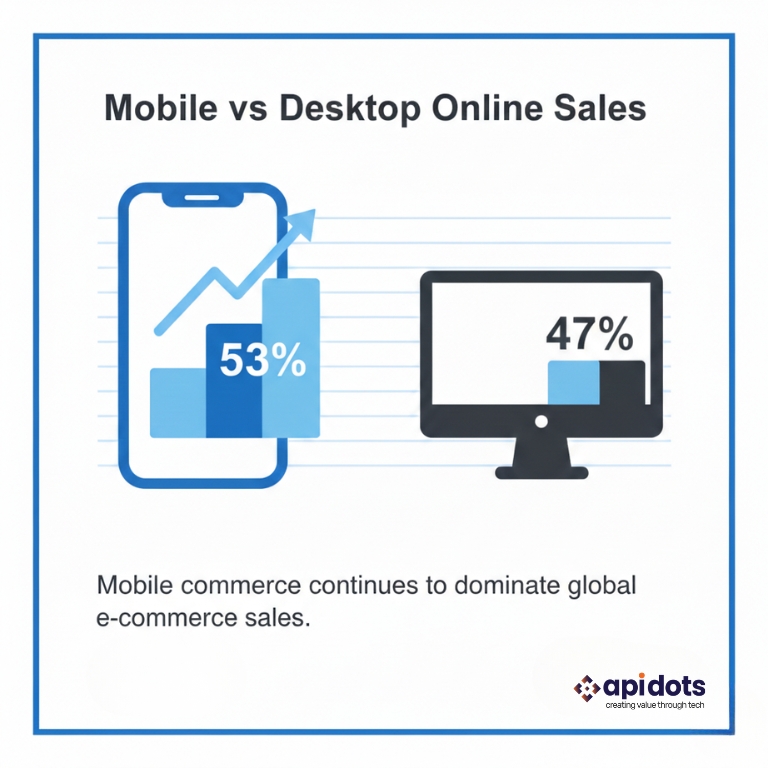
Mobile shopping has become a must for e-commerce. More and more people use their mobiles to shop. Businesses need to keep up with this trend to stay ahead. The numbers on m-commerce are impressive. Over 70% of online shopping carts are created on mobile devices. Though mobile sales are lower, they’re growing. Now, mobile devices make up more than half of all online sales, as recent e-commerce statistics by Adobe Analytics (2024 Holiday Forecast) also show.
| Device | Share of Online Sales |
| Mobile | 53% |
| Desktop | 47% |
It is always important for businesses to have a true grasp on these stats so they can make the right decisions about how to scale and optimize.
In this blog, we’ll explore what mobile e-commerce and mobile-first design are, and why having a responsive e-commerce website is essential for businesses to scale and drive revenue in today’s competitive environment.
The move from desktop to mobile shopping shows a big change in how people shop. Gen Z’s reliance on mobile is another factor that is responsible for this shift. Now, people expect a smooth shopping experience on all devices. Businesses that don’t meet this expectation might lose customers to competitors who do. Success in e-commerce isn’t just about having a mobile-friendly site. It’s about having a mobile-first strategy. This strategy focuses on what mobile shoppers need and want. As it is evident by now, the future of e-commerce is mobile. Businesses that don’t adapt will be left behind.
Most online shoppers use mobiles, making mobile-first design crucial for success. This approach makes sure that the shopping experience is easy on smaller screens, the new standard. It’s about creating a site that works well on mobile.
Mobile-first design starts with the mobile version of a site or app. It focuses on the most important features and content. It’s about designing for the smallest screen first and then scaling up. This way, e-commerce sites are best for most mobile users. Luke Wroblewski, a leading mobile design expert, once noted,
“Designing for mobile first isn’t just about the screen size; it’s about focusing on what’s truly important.”
The truly important elements of an e-commerce site are its content, features, responsiveness, and loading speed. These are all critical factors that can make or break a mobile commerce experience today.
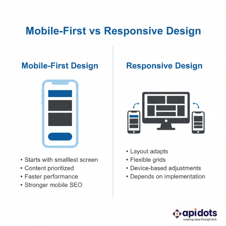
Mobile-first design is different from responsive design. Responsive design changes a website’s layout for different screens. On the other hand, mobile-first design focuses on making mobile content better and then improving it for bigger screens. The main difference is in their approach.
Most online shoppers use mobiles, making mobile-first design key for success. This approach makes sure shopping is easy on smaller screens, the new standard. It’s about creating a site that works well on mobiles. Responsive design is about flexibility. Mobile-first design is about prioritizing content.
| Design Approach | Mobile-First Design | Responsive Design |
| Primary Focus | Prioritizing content for mobile users | Adapting layout for various screen sizes |
| Design Process | Starts with mobile, then larger screens | Can start with any screen size, adapts to others |
The core principles of mobile-first design are simplicity, clarity, and easy navigation. By focusing on these, businesses can make e-commerce platforms on mobile devices look good and work well. Important features include easy navigation, short content, and images that load fast.
Using a mobile-first design can significantly improve user experience. This results in increased sales and more satisfied customers.
In today’s world, having a mobile-first design is essential for e-commerce sites. More and more people shop online using their mobile devices. Businesses need to keep up with these changes.
Google now uses mobile-first indexing for websites. This means Google looks at mobile content first when ranking sites. Having a mobile-optimized e-commerce site is essential for visibility in search results. A report by Search Engine Journal says Google’s mobile-first indexing is now the standard for all new sites. It’s also being applied to existing sites. This shows how important it is for e-commerce sites to focus on mobile optimization to avoid losing rankings.
Key Aspect | Desktop-First Approach | Mobile-First Approach |
Content Prioritization | Often results in cluttered mobile versions | Forces prioritization of essential content |
| User Experience | May lead to a poor mobile user experience | Provides a seamless mobile experience |
| Search Engine Optimization (SEO) | May suffer from mobile-first indexing | Improves SEO with a mobile-friendly design |
Testing for mobile friendliness is a crucial step in developing e-commerce sites. There are many testing tools available for mobile usability, including device emulators to real device testing.
Optimizing a mobile e-commerce website is vital for improving the user experience and your conversion rate. Performance optimization can be achieved in several different ways, including CDN usage and caching systems, which all contribute to the optimization of a site’s performance.
Creating an effective m-commerce platform requires avoiding common design mistakes. Focus on user experience and conversion rate optimization to stay competitive. This is essential as you develop your mobile e-commerce site.
M-commerce is set for big changes. New tech like voice shopping and augmented reality will change how we shop. These changes will deeply impact how we use mobile shopping platforms.
Voice Shopping and AI-Powered Experiences
Voice shopping is becoming more popular. E-commerce sites are also using AI. Voice shopping is gaining traction, with more users utilizing Siri, Google Assistant, and Alexa to make purchases due to its ease and convenience. E-commerce platforms are leveraging AI to maximize customer satisfaction.
Augmented Reality Product Visualization
Augmented Reality is changing the online product discovery dynamics, with AR utilized to visualize how products look in our living environment and physically on us (if necessary), which reduces buyer’s remorse, especially when purchasing big-ticket items online…
This is useful when the items are furniture, fashion, and cosmetics. The benefits of augmented reality for e-commerce platforms are:
With e-commerce thriving at breaking speed these days, having a mobile-first approach is key. As more consumers shop on mobile devices, having a responsive e-commerce site is vital to attracting customers and increasing site conversion. Mobile e-commerce or M-commerce is changing the way companies do business. It means everything from Google’s mobile-first indexing to providing mobile resources that can guide users with simpler navigation. To meet mobile shoppers’ needs, a mobile-first approach will help you stay ahead of your competitors. When building your online presence, be sure to also focus on mobile. The easier and faster you can implement a mobile experience, the better your chances are to convert a user, reduce bounce rates, and increase customer loyalty in the mobile e-commerce experience. If you are ready to invest in e-commerce web development, consider Apidots as your trusted partner. It will help you build a scalable and future-proof platform. With our E-commerce development solutions, including M-commerce optimization, you can grow strategic relationships, create operational efficiencies, and pursue new growth opportunities.
1. What is the difference between mobile-first and responsive design?
Mobile-first starts designing for mobile screens first, while responsive design adapts layouts for multiple devices.
2. Why does Google prioritize mobile-first indexing?
Because most users browse and shop via mobile devices, Google ranks sites based on their mobile version.
3. Does mobile-first design improve conversion rates?
Yes. Faster load times and simplified navigation significantly reduce bounce rates and increase purchases.
4. How can I test my e-commerce website for mobile performance?
You can use emulators, real device testing platforms, and performance monitoring tools to ensure cross-device compatibility.
5. Is mobile-first design necessary for small businesses?
Absolutely. Mobile shopping dominates across business sizes, making mobile optimization essential for growth.
We design and develop secure, high-performance web and mobile applications.Ensuring scalability, reliability, and long-term product success.
Hire App Developers
Hi! I’m Aminah Rafaqat, a technical writer, content designer, and editor with an academic background in English Language and Literature. Thanks for taking a moment to get to know me. My work focuses on making complex information clear and accessible for B2B audiences. I’ve written extensively across several industries, including AI, SaaS, e-commerce, digital marketing, fintech, and health & fitness , with AI as the area I explore most deeply. With a foundation in linguistic precision and analytical reading, I bring a blend of technical understanding and strong language skills to every project. Over the years, I’ve collaborated with organizations across different regions, including teams here in the UAE, to create documentation that’s structured, accurate, and genuinely useful. I specialize in technical writing, content design, editing, and producing clear communication across digital and print platforms. At the core of my approach is a simple belief: when information is easy to understand, everything else becomes easier.